top of page
Anchor 2

Jeopardy! Rebrand
GSU
CLIENT: SONY
Brief
After our greatly received work from PepsiCo for the Cheetos project, we had the opportunity to work with SONY. The other half of the class worked with HULU. To start this project off we created the branding of a fictional agency to represent us as a team. I created the logo and others helped to make the presentation visually cohesive with the brand we created. I also created the branding for the rebrand. Throughout the semester we presented and communicated with Senior Vice President Brand Creative & Marketer Kasumi Mihori and Creative Director Marc Juon. They wanted to see how we could brand Jeopardy! in a more modern and refreshing take.
Strategy
Our team split up into separate jobs that would come together in the final presentation. Trinity Gordon and I would work on the main title and other groups of two would create branding and marketing materials for the show. I worked on the overall branding and look of the main title which influenced the rest of the deliverables. For our final presentation, the Sony team was very impressed with the outcome.
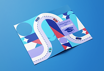
CONTENTS
LOGO
MERCH
PACKAGING
EXPERIENTIAL
ADVERTISING
TEAM
TRINITY GORDON (MAIN TITLE PARTNER)
BELLA MAZZURRA
ERIKA NI
CHARLIE BUICE
MARY BUI
MAYA JUSUFHODZIC
MANSZE CHOI
CHASE CROSS
KATYA CAMPBELL
Anchor 1
After our greatly received work from PepsiCo for the Cheetos project, we had the opportunity to work with SONY. The other half of the class worked with HULU. To start this project off we created the branding of a fictional agency to represent us as a team. We all created logos and branding ideas and voted. My design was chosen and we worked to make the presentation visually cohesive to the brand we created.


Team SONY/Pixel and co.
Ideation
Our main goal for this rebrand was to make Jeopardy! more likable to a younger audience. Our plan was to make the visuals more modern and fun but also utilize popular platforms like Twitch to get more eyes from this age group.
-
Target Audience: 16-35
-
Message: Being smart is cooler than you think.
-
Call to action: Watch the current season and engage on social media!
-
Utilizing:
-
Short form content (Tik-Tok, IG)
-
Long form content (Twitch, Youtube)
-
Print (QR Codes and AR)
-
Brand identity process


Describe your image

1/7
Main Title
These two graphics were made for the main title animation specifically but also for the overall graphics other members of my group could use for the different deliverables. It had to work for 2D and 3D spaces. Specifically for the main title, the shapes would be shuffled in the first shot and come together to create a unified composition and logo at the end of the title The shapes would also come out of the foreground and I had to keep this in mind when designing this.

1. Puzzle pieces shuffled, 1st frame

2. Puzzle pieces coming together


bottom of page